The concept.
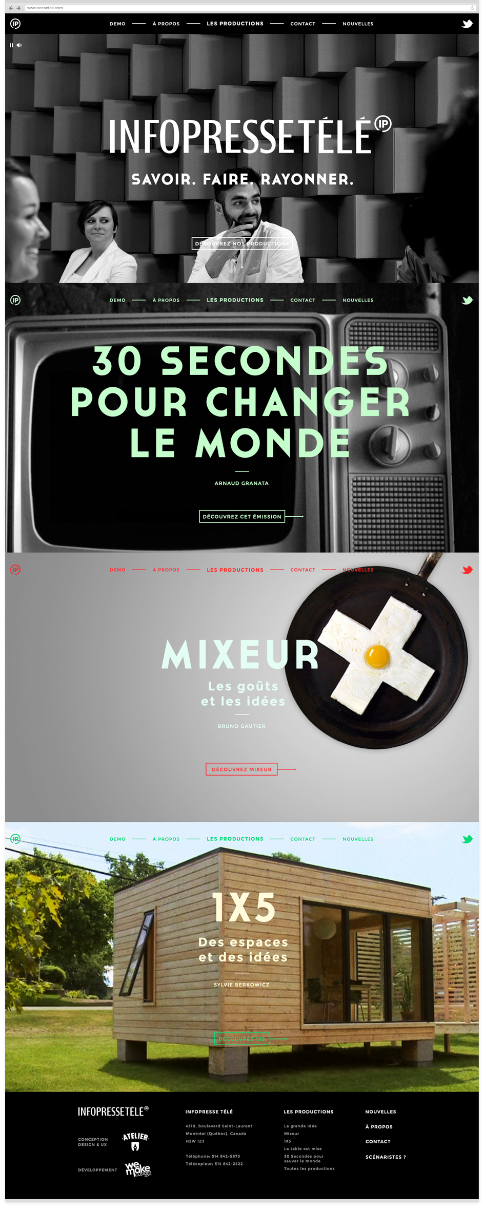
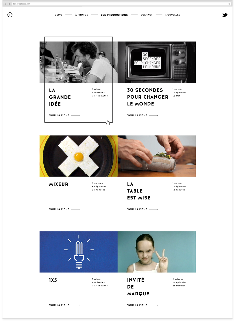
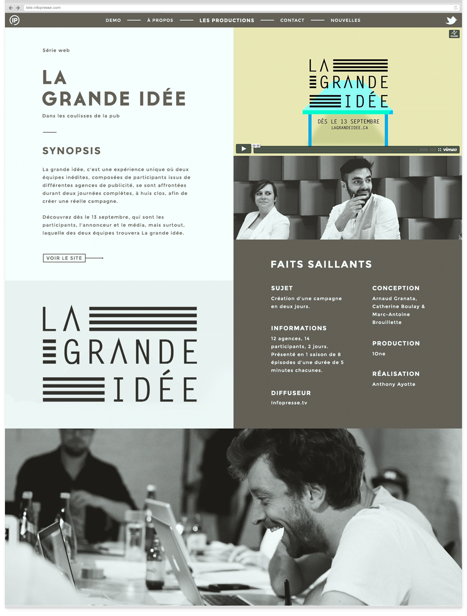
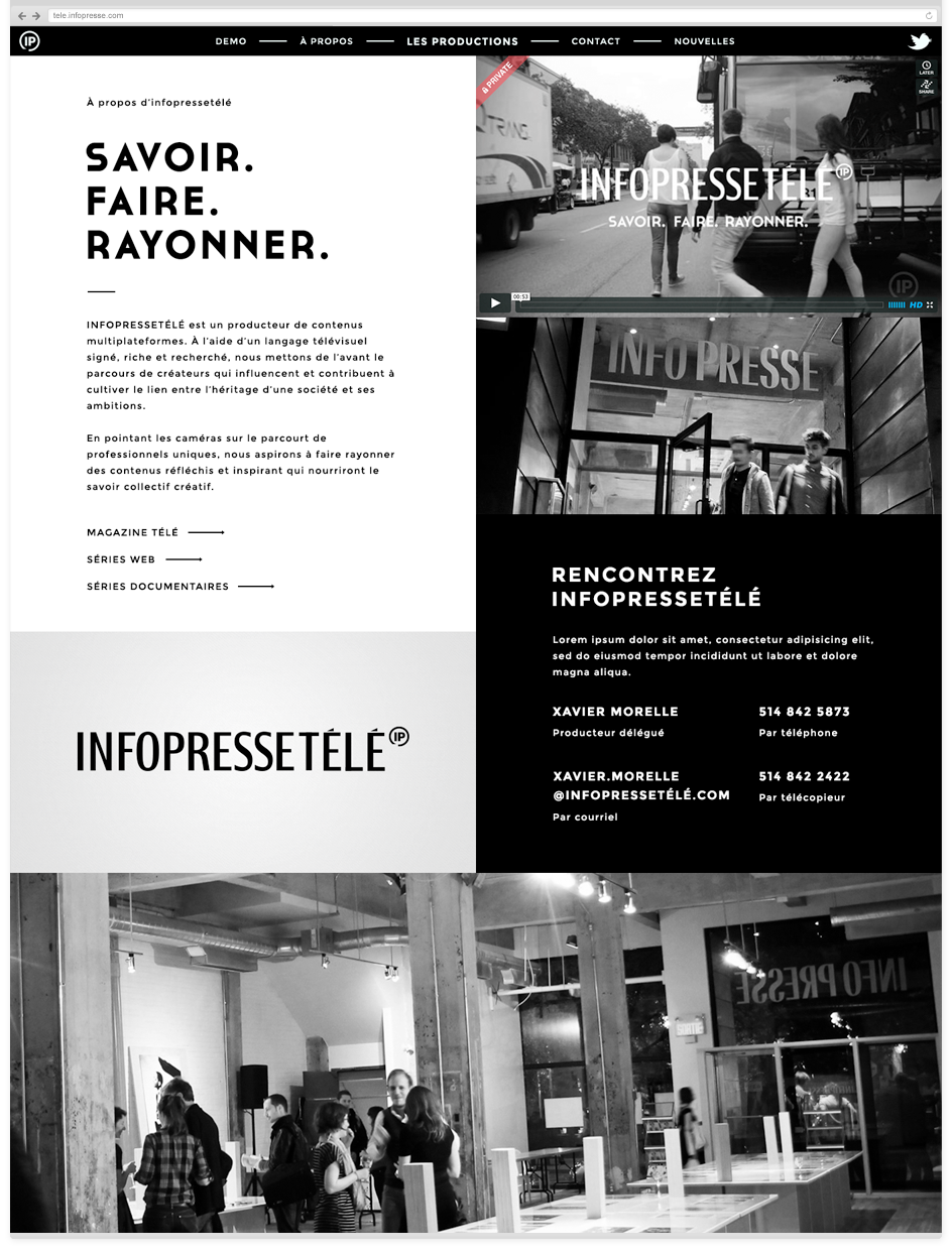
Colors.
.
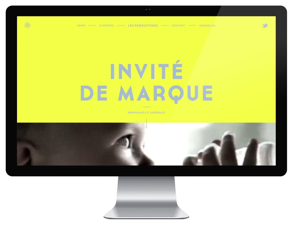
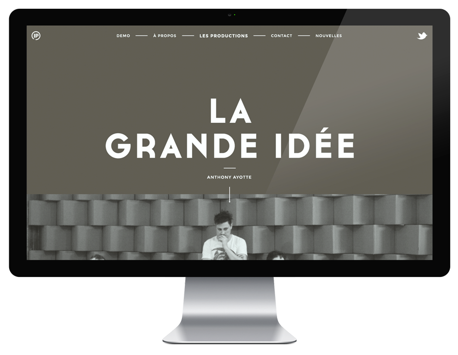
Video.
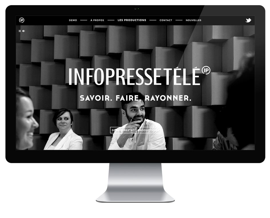
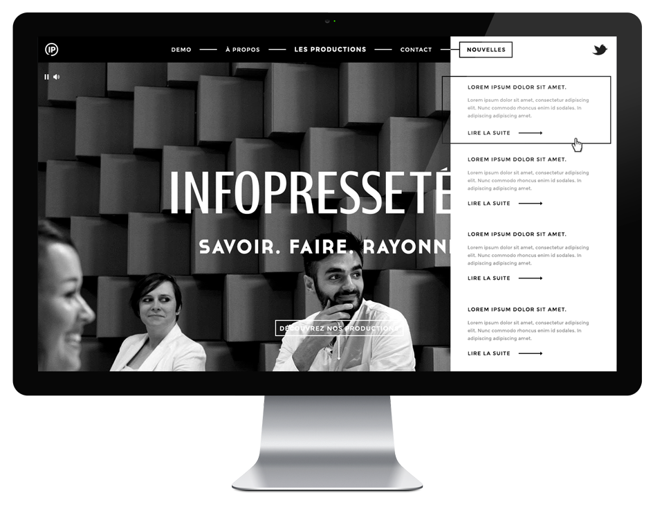
I created a video for the first screen of the homepage. Sort of a demo reel but more for mood than showcase. I wanted users to have an experience as soon as they arrived on the website. The video is fullscreen. You only have the logo, navigation and call to action on top guiding you to the next step. The client decided to go with another video in the end.
Stationery.
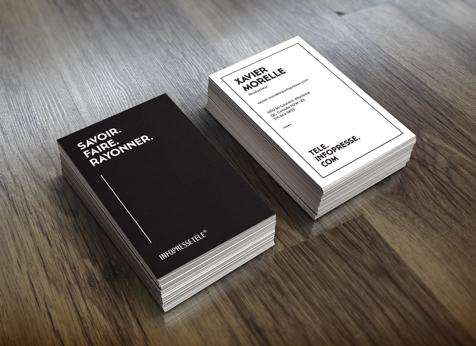
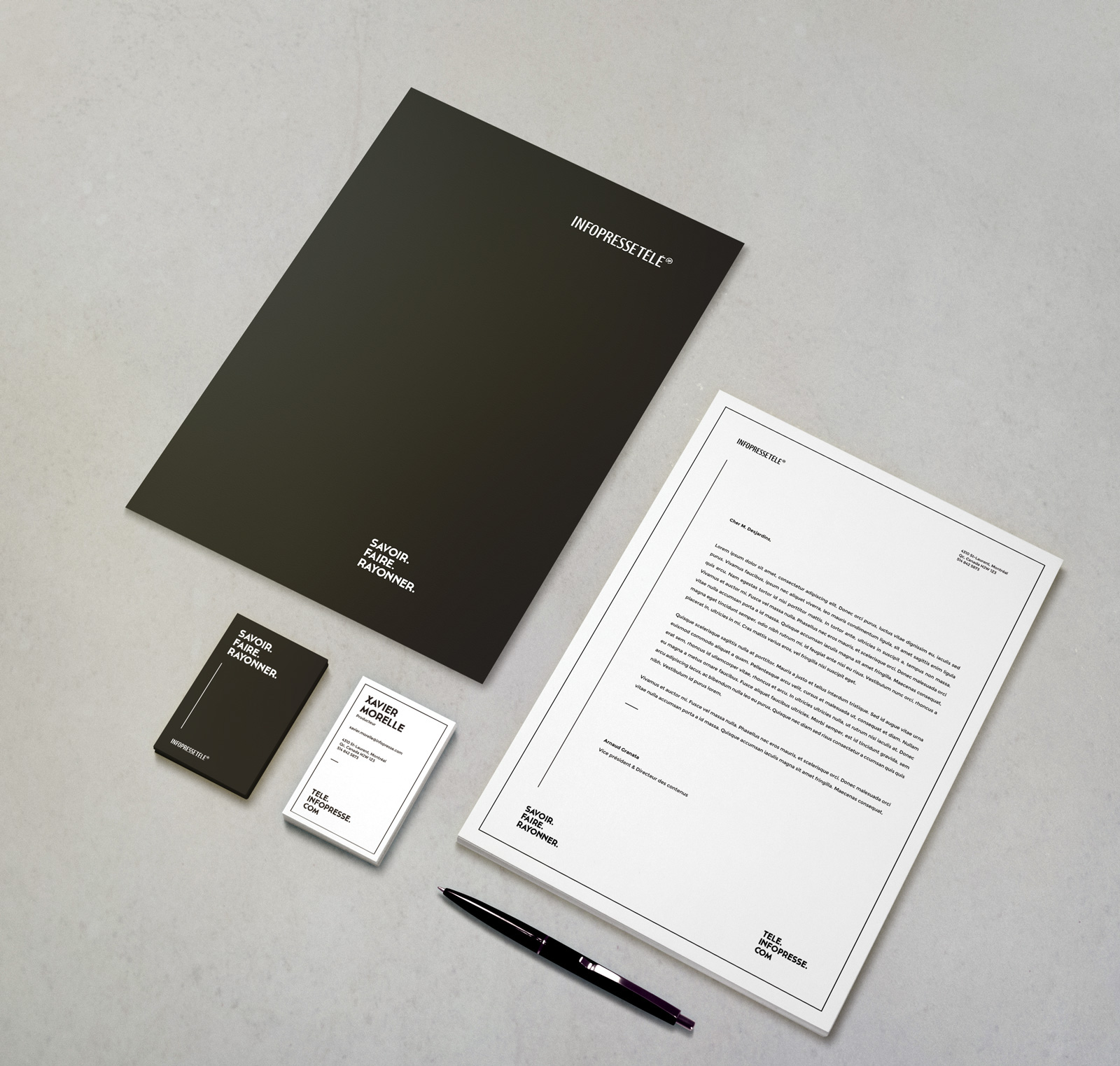
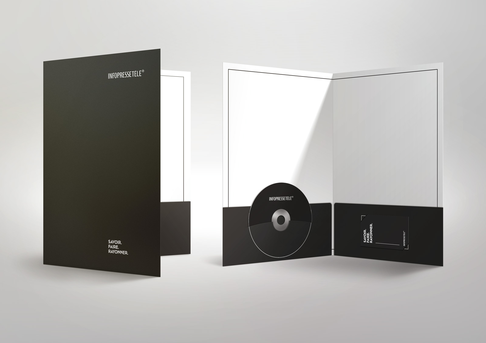
New brand. New stationery. I had to create business cards, folders and more to go with the launch of the new brand and website. The art direction was elaborated from the website. Having created a lot of graphic elements it was than easy to put together the following.
