This project was a pitch for the website design of the upcoming game Lego Minifigures developped by Funcom. Two approaches were submitted. They decided to go with another approach in the end.
First Approach
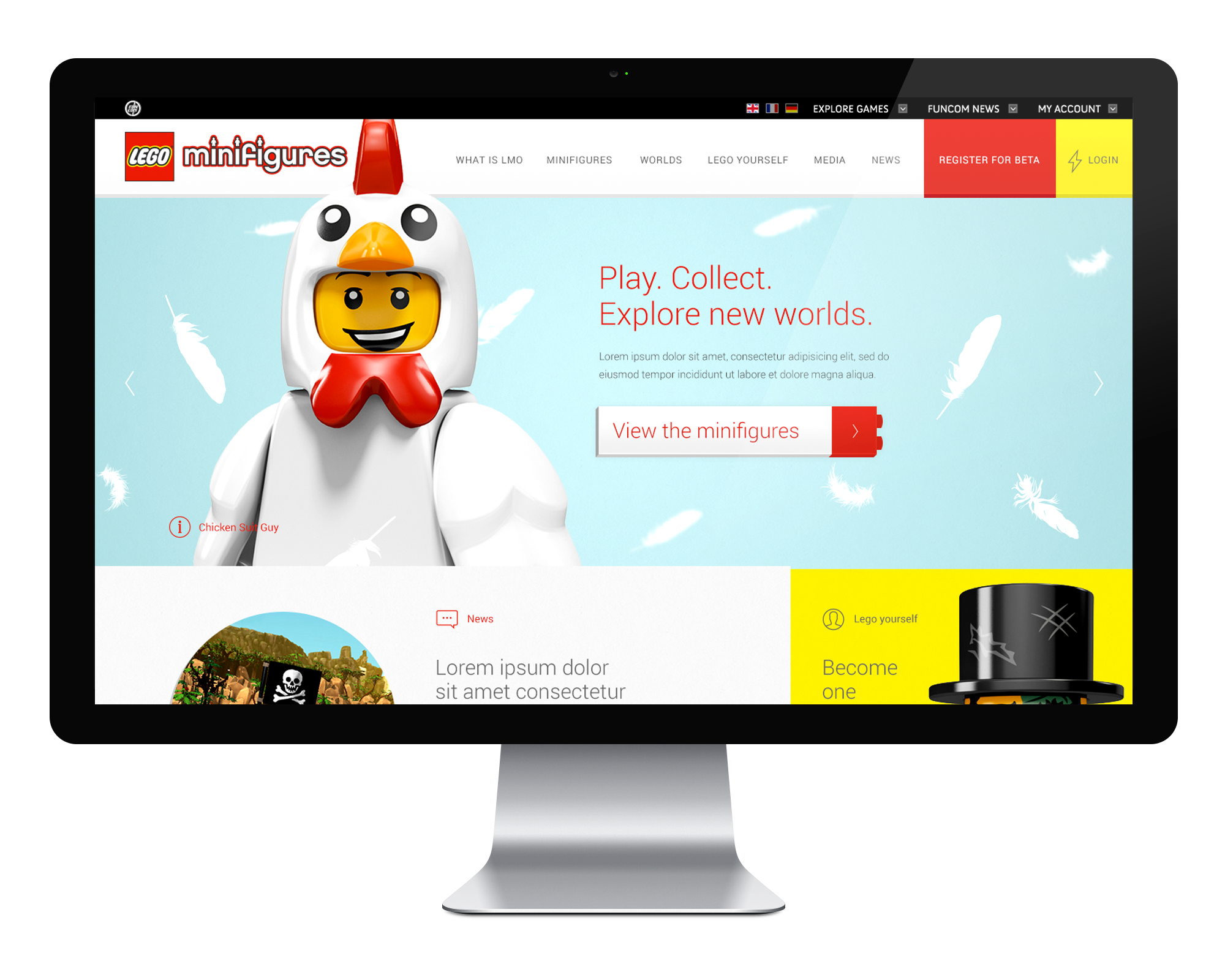
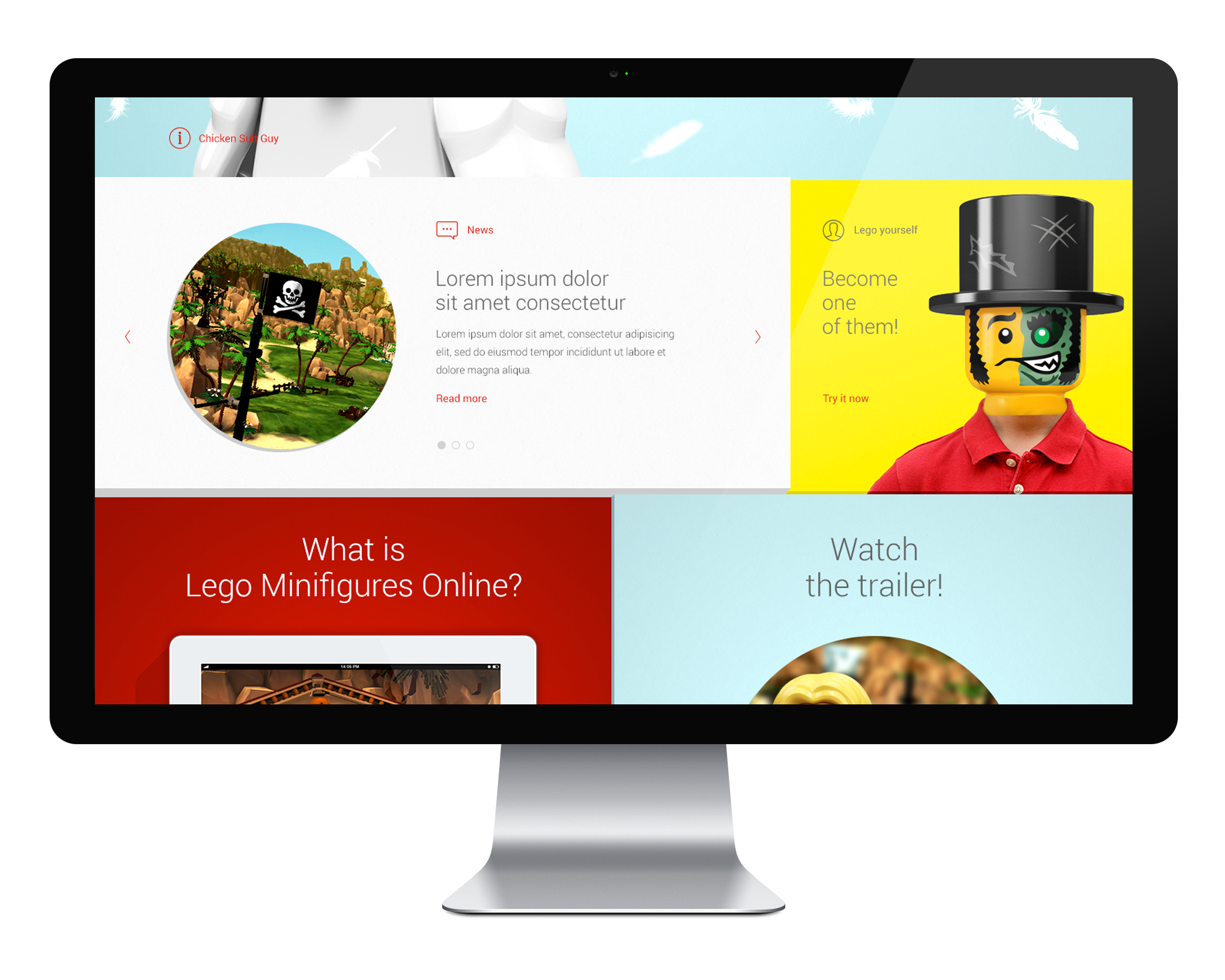
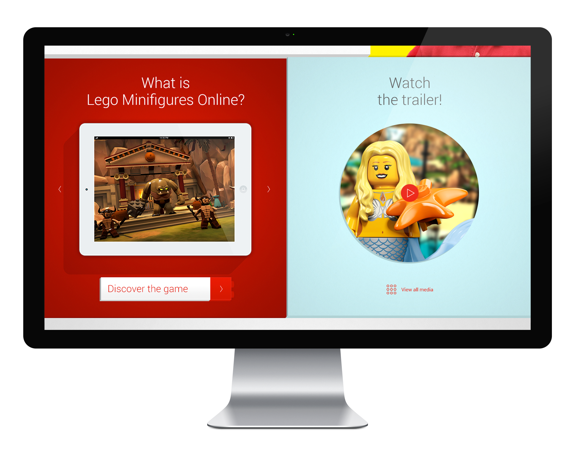
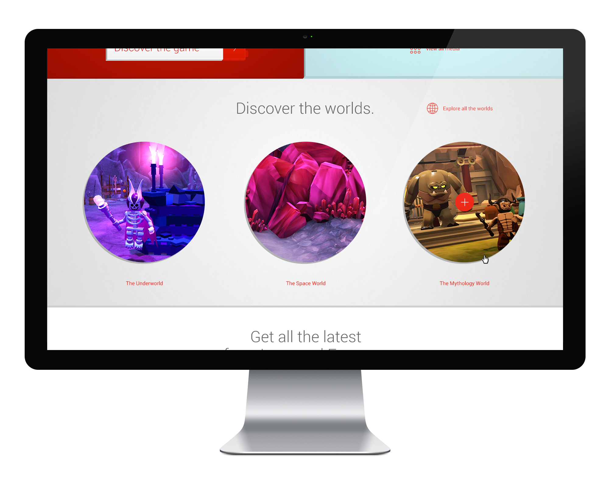
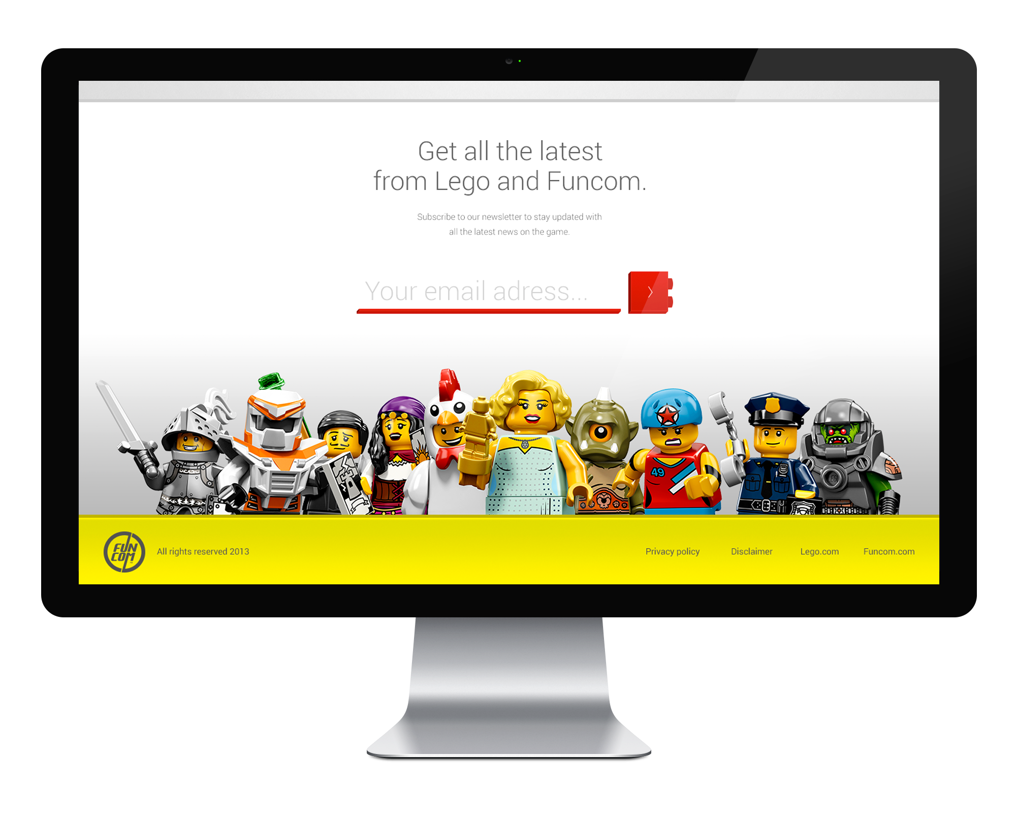
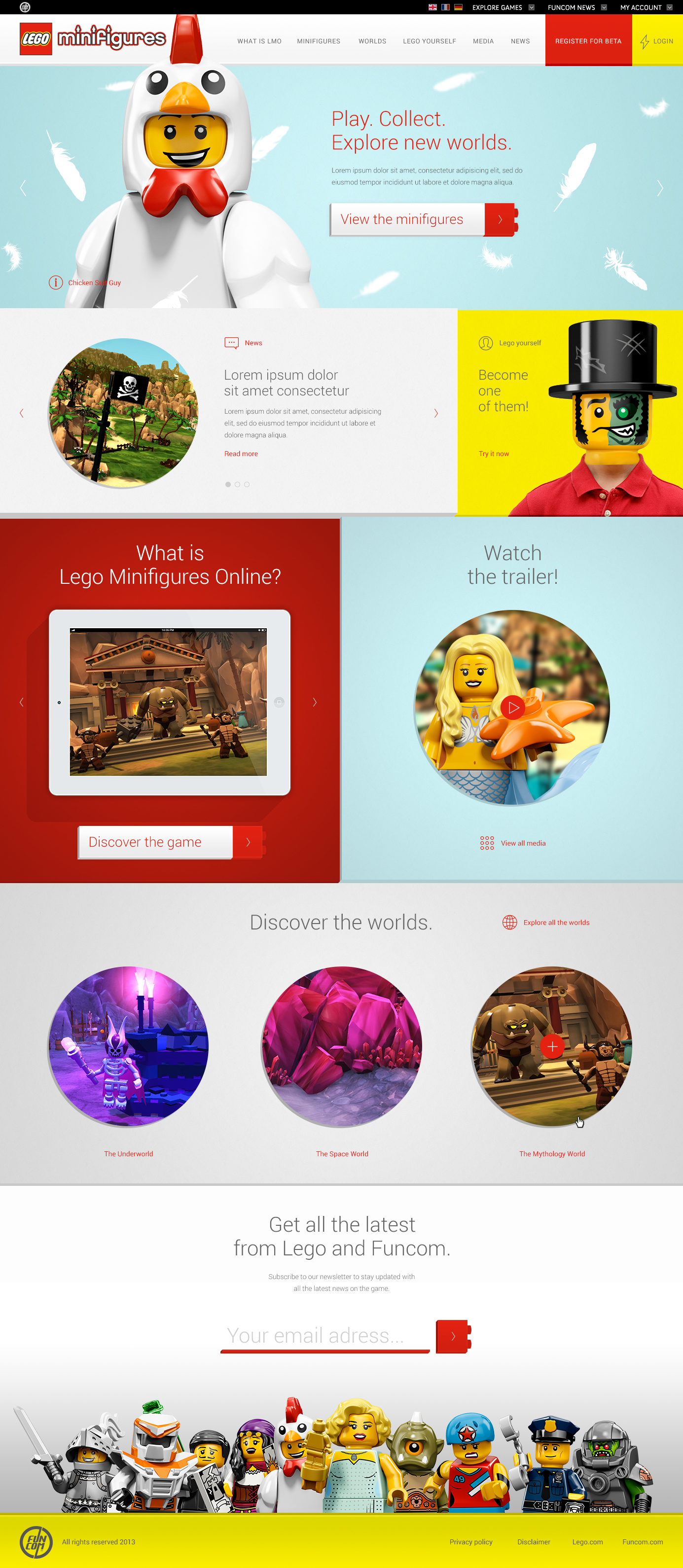
The main feature of the game is that you can collect loads of minifigures and play with each of them. The idea here was to create a homepage that would give the user a quick overview of this feature and what the game is about. Browsing through minifigures, getting the latest news, exploring the worlds and subscribing to the newsletter are all part of this homepage that also doubles as a game prelaunch platform.
The predominant top part of the page features the minifigures. You can browse through them using the left and right arrows. Each minifigure has an animated background with a certain depth of field applied to the elements. In this case, feathers are slowly falling down behind the chicken.
I also wanted to stay away from the obvious block approach that lego could have. I decided instead to go with a subtle 3D look. Each portion of the page is slightly elevated compared to the next one giving a feeling of blocks. The right side of the call-to-actions also show a subtle reminder of where Lego came from.
_
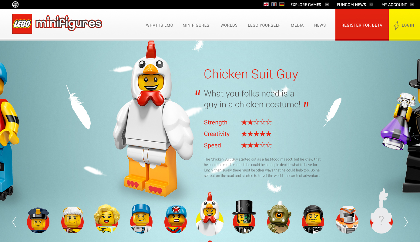
This is an exemple of the minifigures page. You have all the minifigures lined-up and you can browse through them. You can unlock content in the website if you complete certain taks (browsing all the sections, loging in to facebook, looking at all the minifigures, etc...). The site becomes a little game in it self.
_
Second approach
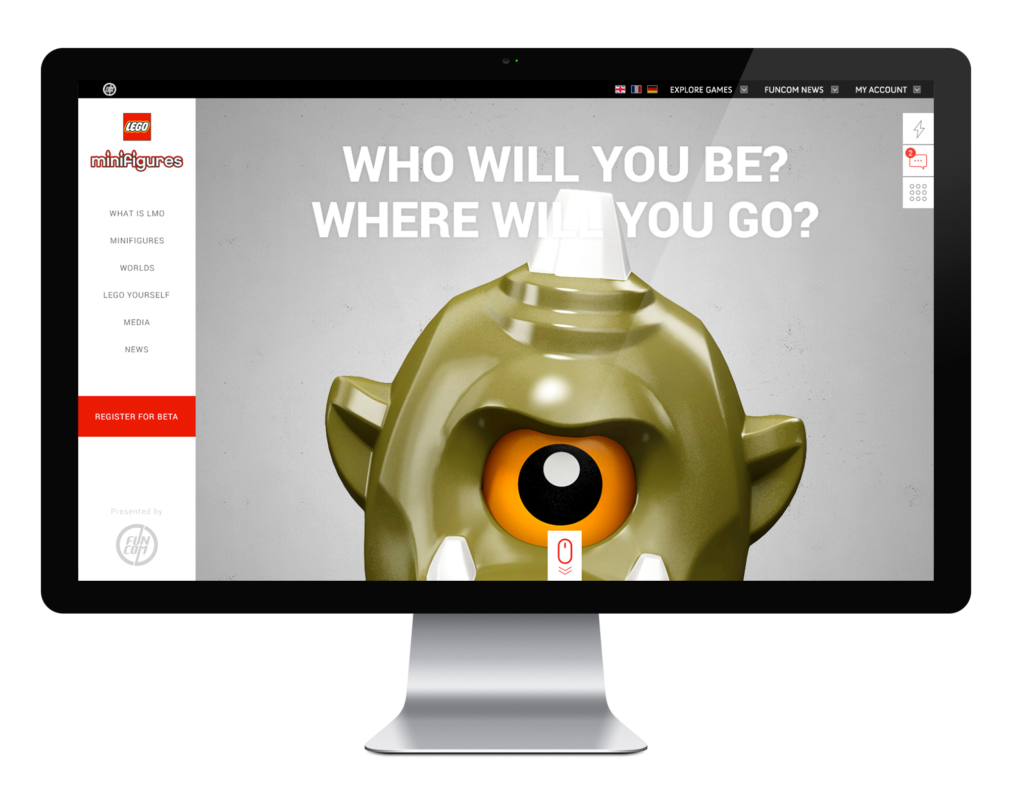
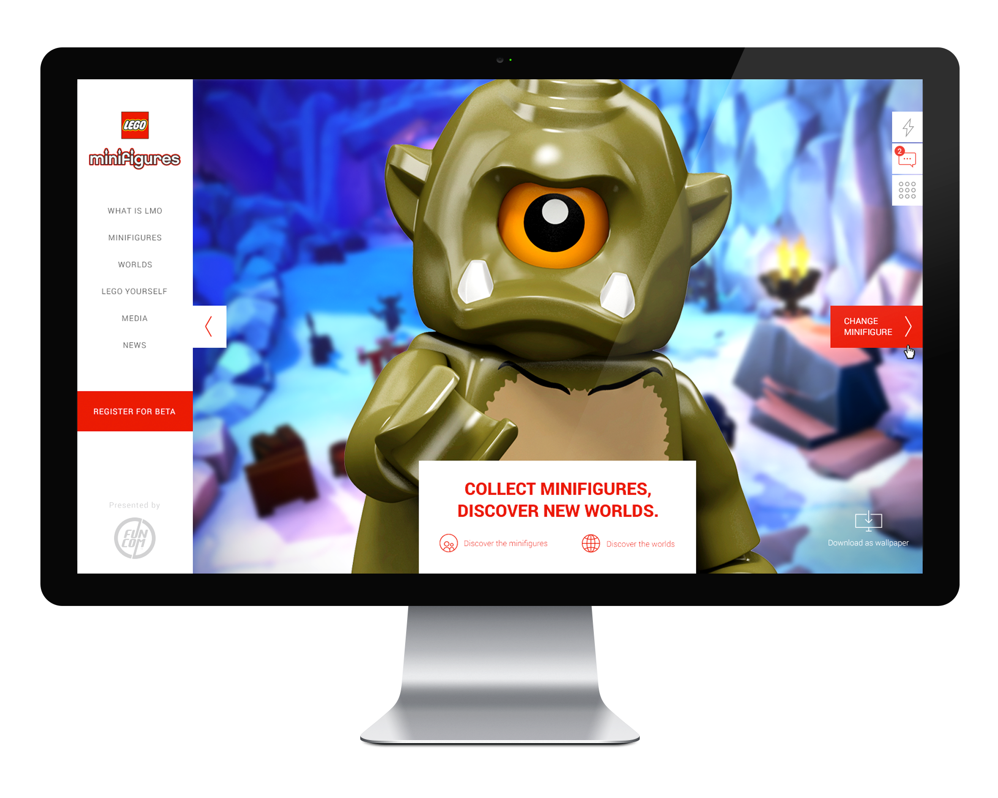
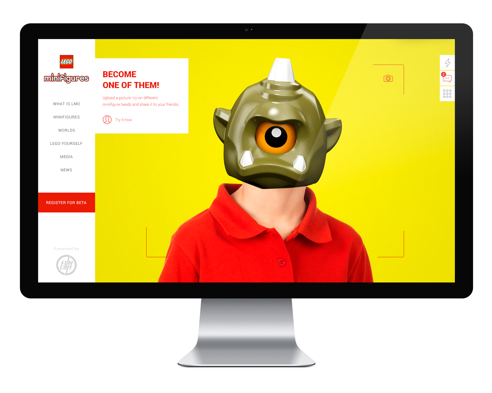
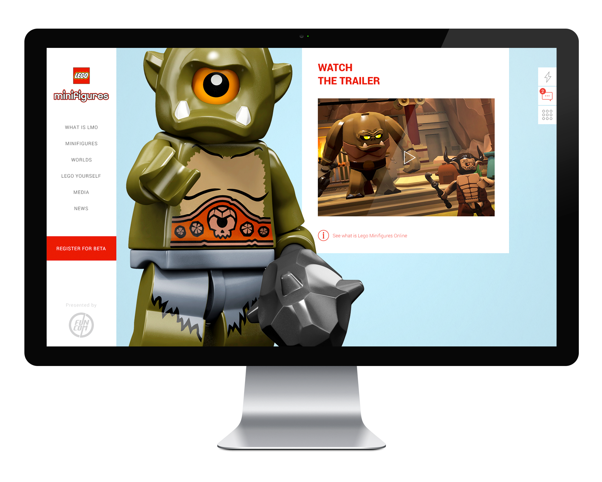
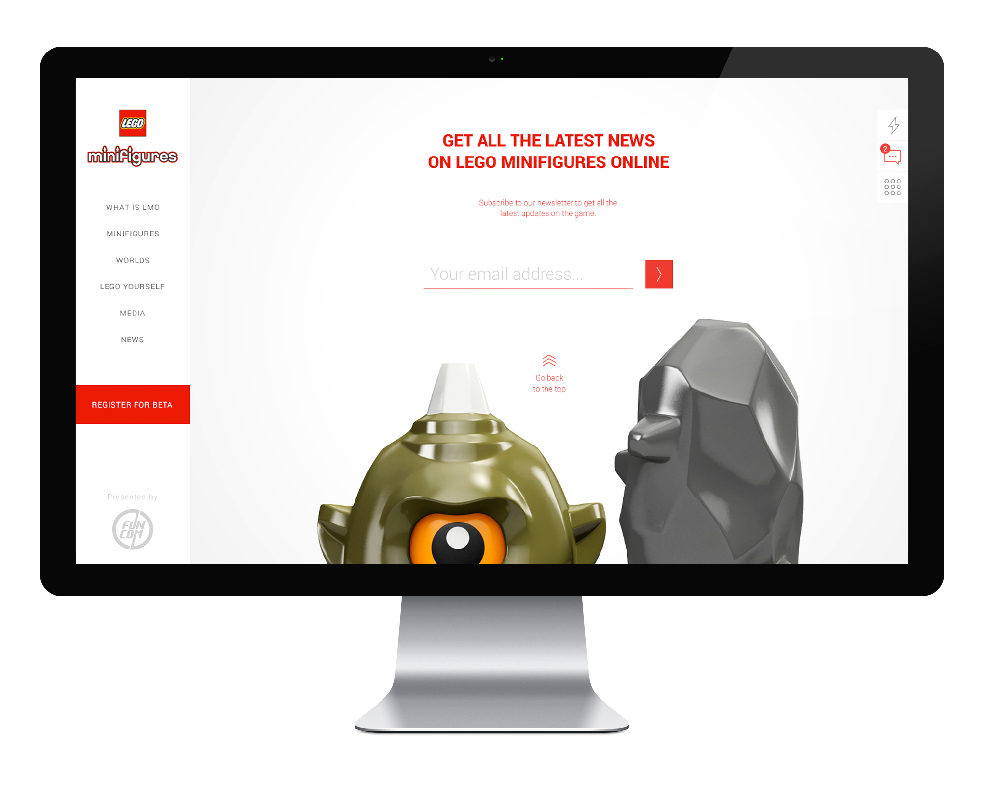
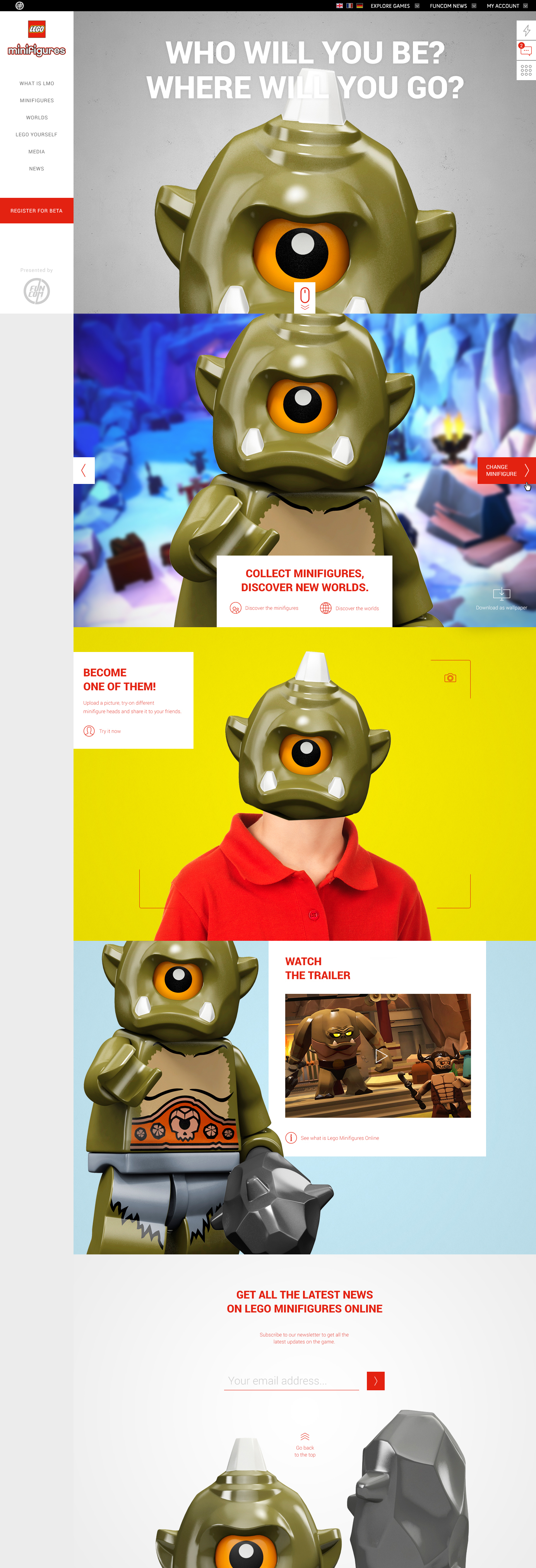
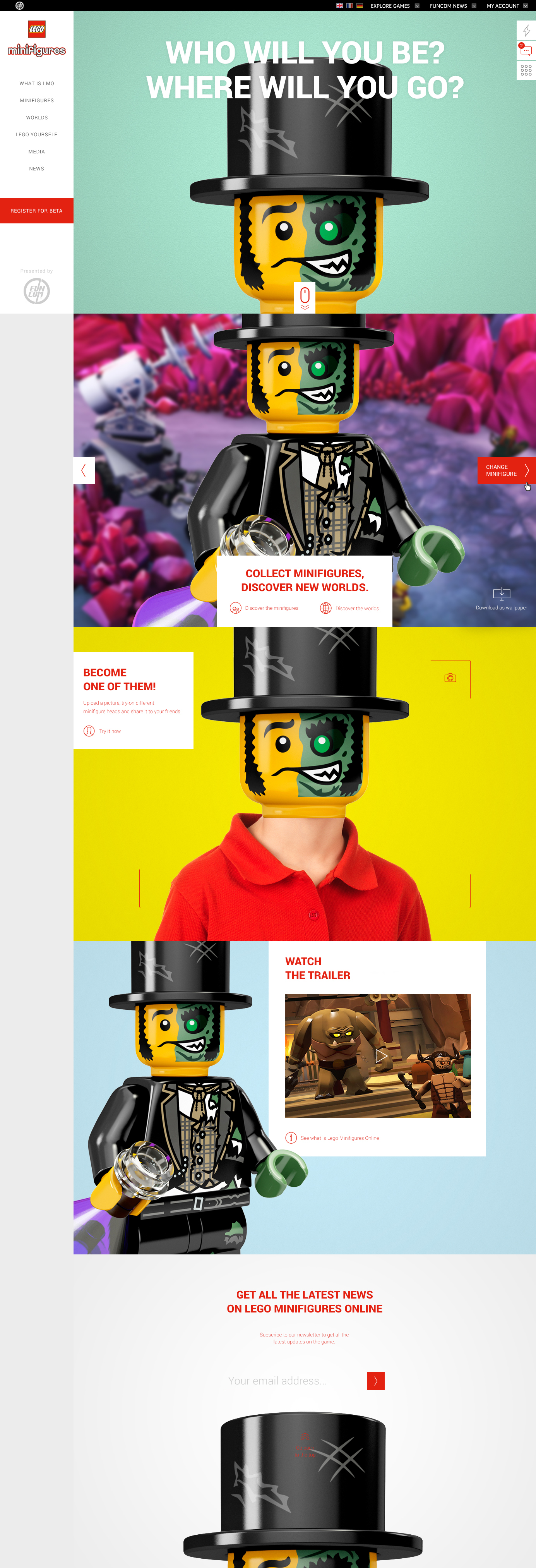
This second approach is a little more immersive. The homepage takes the user through all the different content in a fun way where you choose your minifigure and you discover it while you are scrolling. Again all the key content is present on this homepage, you can even open your webcam and portrait yourself as the minifigure you chose. The minifigure moves and scales as you scroll.
A notification system is present on the right side removing the clutter that this brings to a page. This is where you login, see the latest news and media. A little number indicates if there is new content since your last visit.
_
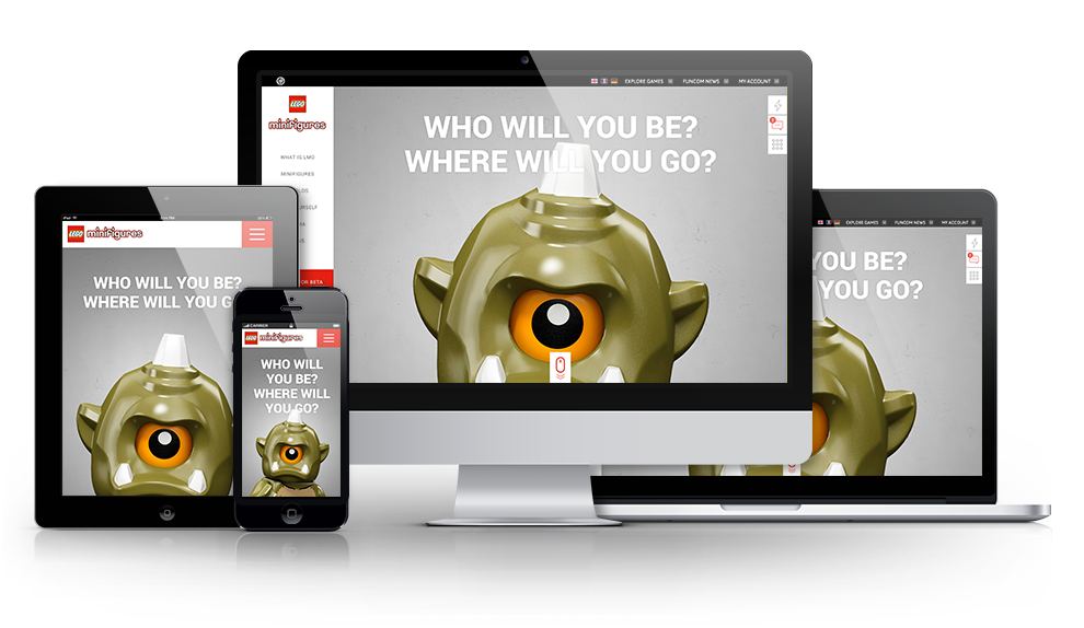
Responsive
Thank you for scrolling!